EXHIBITION

http://www.mckenziefineart.com/exhib/Small-World-2024-exhibition.html

Small World
July 19 - August 23, 2024

Don Voisine, Untitled, 2023

Oil and acrylic on linen over wood panel, 6 x 12 in.

This exhibition features over forty small-scale abstract paintings and drawings, ranging in size from 6 to 16 inches square, by nineteen artists: Chris Arabadjis, Mel Bernstine, Nancy Blum, Paul Corio, Lori Ellison (1958-2015), Chris Gallagher, Jenny Kemp, James Lecce, Maureen McQuillan, Nick Naber, James Nelson, Aric Obrosey, Rob de Oude, Gary Petersen, Jessica Deane Rosner, Pete Schulte, Don Voisine, Laura Sharp Wilson, and Deborah Zlotsky.
 
The intensity of focus and intimate scale of the works offer viewers the pleasurable rewards of slow and careful observation and affirm that expansiveness, depth, luminosity, and monumental scale can be achieved no matter the size of a panel or sheet of paper.
 
Drawings in ballpoint pen by Chris Arabadjis, in colored pencil by Nancy Blum, and in gouache by Jenny Kemp, undulate and pulsate with biomorphic and organic energy. James Nelson draws careful and discrete all-over fields in graphite and charcoal, while Jessica Deane Rosner creates exquisitely patterned imagery in ink. Also rendered in ink are Aric Obrosey’s detailed drawings, whose structure references Frank Stella’s Black Paintings, while Nick Naber creates colorful architectonic aerial views in watercolor and marker pens. Pattern and repetition are explored with devotional intensity by Lori Ellison in marker and ink drawings on notebook paper. Pete Schulte’s graphite drawings are remarkable for the precision of their simple forms, their nuanced rendering, and glowing light.
 
Layered translucent color, spatial depth, and organic forms are explored in the acrylic polymer paintings of Maureen McQuillan and James Lecce. A jungle-like density of intertwining botanical and decorative shapes painted in acrylic by Laura Sharp Wilson contrast with the spatially expansive, curving bands in Chris Gallagher’s oil painting. Disarmingly sophisticated color and spatial interactions are explored in Gary Petersen’s playful and irregular geometries, while Mel Bernstine creates sumptuous and ornamental patterning in his acrylic painting. Working in vivid oil colors and banded arrangements, Deborah Zlotsky references historical systems of identification in her paintings. Rob de Oude uses subtle color transitions to create a mysterious inner light in his meticulously layered grid compositions, while Paul Corio creates a brightly hued checkerboard that seems to float above a contrasting ground. Don Voisine’s reductive and elegant geometric abstractions explore sculptural and architectural space, implying a monumental scale that belies the actual size of the paintings.

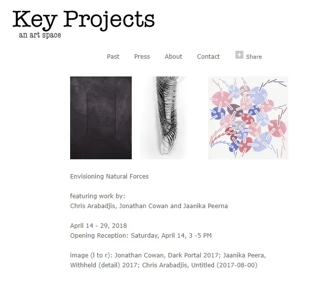
left: Chris Arabadjis, Untitled (2024-03-002), 2024

Ballpoint pen on paper, 2024, 11 x 10 in.

right: Jenny Kemp, Untitled (Vernalis #3), 2024

Gouache on paper, 2024, 8 1/4 x 5 7/8 in.

EXHIBITION

https://www.realtinsel.com/

June 1 – June 23, 2024
Opening Reception, Friday, June 7 from 6-8 pm

This is how the conversation started: “The world is made of two forces that can only be named in relation to one another.”

And of course, someone brought up the Tao Te Ching…

which begins:

The Tao that can be told is not the eternal Tao.

The name that can be named is not the eternal name.

The nameless is the beginning of heaven and Earth.

This led to further exchange about how language and visual arts shadow each other. While language is often a practical or perlocutionary agent, as the great language surgeon Jürgen Habermas labeled it, when it is expressive and persuasive (illocutionary) it relies on a set of oppositions such as: rule/exceptional; norm/aberration; restriction/permission that bears fruit in the visual universe as well. We decided that the coincidence between art and language was more than happenstance; it was analogous, possibly even elemental.

As the framework firmed up, our conversation became more fluid, organic, and naughty. Someone proposed an idea for an exhibition: “Sore thumbs!!!” as in sticking out like sore thumbs.

“The best stuff sticks out in just the right wrong way,” she said.

“Then it needs another layer of unamability so it’s a sore thumb of sore thumbs.”

“Sword Thumbs?”

“Like Edward Scissorhands?”

Which was funny, because the character was a sore thumb. A disruption. A deviant. A misfit. But in the most graceful and organic way.

We had put down the brushes and were painting with words at this point.

“Sword Thumbs” features thirteen artists whose work subverts, destabilizes, disrupts, and surprises with a deceptively simple set of oppositional forces that give rise to universes of excited possibilities.

EXHIBITION

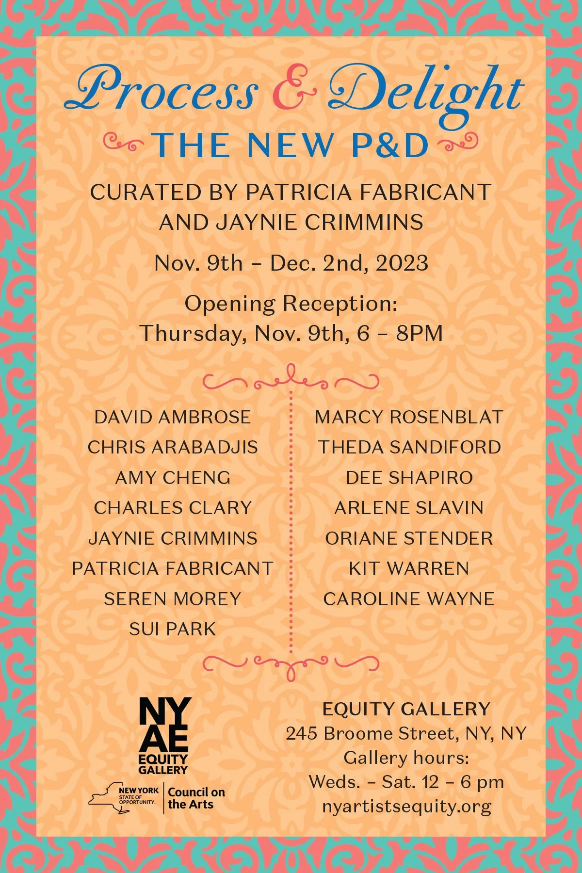
Process and Delight: The New P & D

Thursday, November 9 - Saturday, December 2, 2023

The Pattern and Decoration movement was born to counter male-centric minimalistic trends. Emerging in the 1970s, it foregrounded elaborate patterns interwoven with global influences and boldly challenged Eurocentric paradigms through its distinct voice, especially when interpreted through a feminist perspective. The "Process and Delight: The New P&D" exhibit illustrates this movement's enduring impact on contemporary art and pays homage to the tradition of the 1970s P&D movement.

The contemporary artists showcased, informed by this tradition, are more than mere revivalists. Their layered surfaces carve out immersive worlds that reflect our zeitgeist—spaces that celebrate complexity in form and content through an unabashedly maximalist ethos—artworks abundant with detail, pattern, and repetition. Highlighting the P&D continuity, one cannot miss the inclusion of Arlene Slavin and Dee Shapiro, two pivotal figures from the original movement. Slavin and Shapiro enrich the exhibit with their signature use of luminous colors and intricate grids. 

Marcy Rosenblat and Oriane Stender also use bold colors and detailed motifs, specifically referencing textiles, evoking an engaging dialogue with what was traditionally perceived as "women's work." Patricia Fabricant, David Ambrose, Charles Clary, and Kit Warren masterfully intertwine natural motifs with patterned details. Simultaneously, Sui Park and Jaynie Crimmins offer critiques on materialism, Park with her repurposed industrial objects, and Crimmins through her use of post-consumer remnants. The materiality in Caroline Wayne’s and Theda Sandiford’s works taps into deeply personal stories while resonating universally. Seren Morey, Amy Cheng, and Chris Arabadjis further diversify the collection, drawing intriguing lines between art and physics, abstraction, and representation.

Collectively, the voices in "Process and Delight" vibrantly celebrate the fusion of artistry, craft, technique, and the intertwining of beauty with excess.

— Etty Yaniv

EXHIBITION


Abstraction from Nature
July 7 - August 18, 2023

 
The exhibition explores natural forms and the ways they are abstracted in nearly 60 small-scale, intimate drawings, paintings, and sculptures. Artists include Chris Arabadjis, Nancy Blum, Abby Goldstein, Jessica Deane Rosner, Katia Santibañez, Denise Sfraga, Sarah Walker, Marian Williams, and Laura Sharp Wilson.
 
Chris Arabadjis creates rule-based drawings using ballpoint pen, made largely during his daily two-hour subway commute. The works reflect his range of interest in natural systems such as mycelium networks, tessellations of tree rings, irregular rock formations, and whirlpools in bodies of water. Pulsating with an inner, organic energy, Nancy Blum’s fanciful and inventive colored pencil drawings evoke sea creatures, botanical shapes, and microscopic imagery, captured in movement and growth. Also included are stylized butterfly sculptures cast in China clay, with markings transformed into geometric patterns reminiscent of Islamic tile work. Abby Goldstein’s densely patterned paintings of biomorphic shapes, clusters of tiny marks and intertwining linear elements, are inspired by her wanderings through the urban environment, walks in the wilderness, as well as music and dance. Created intuitively and with a reduced palette, her rhythmic compositions evoke both a twilight otherworldliness and a rejuvenating energy. Jessica Deane Rosner has long explored the contrast of freehand drawing versus the use of templates and tools in her intimate and detailed geometric abstractions. In recent years she has incorporated leaf imagery into her compositions as a way to expand the work both intellectually and emotionally; the leaves are “a small, essential part of, and connection to, the natural world.” Katia Santibañez’s obsession with spirals, based on observations of natural forms such as snail shells and spiderwebs, began in 2012 after spending four months on an island in the south of France. For the artist, the spiral is an exploration of the dualities of control and freedom, positivity and negativity, hope and despair. In their implication of endless movement, they are also an expression of renewal, desire, and joy. Denise Sfraga’s vividly colored and stylized botanical environments pay homage to the history of horticultural illustrators and pioneers of flora photography, while reflecting her own captivation with the inherent mystery of plants. For Sfraga, “my work attempts to pull back the curtain of a quiet, contemplative garden and reveal a more sinister, devious and cunning reality lingering just below the surface.” For the past few years Sarah Walker has been gathering fallen leaves during walks in the city and countryside. Drawing in colored pencil, the artist transforms the brown, desiccated, and decaying shapes into imaginatively patterned and multi-colored small universes that are poignant in their isolation. Marian Williams’ layered ink drawings are created slowly and methodically, using ballpoint pen on ledger paper. The isolated, close-up frontality of her floral and botanic imagery suggests the fecundity and intensity of the natural world. Laura Sharp Wilson began to make botanical-based paintings after reading Bill McKibben’s seminal 1989 book, The End of Nature. Combined with references to the decorative arts, stylized botanical imagery is transformed into symbols of class and social stratification, while also serving as a reminder of the constant threat of environmental destruction and the potential for renewal and regrowth.

EXHIBITION

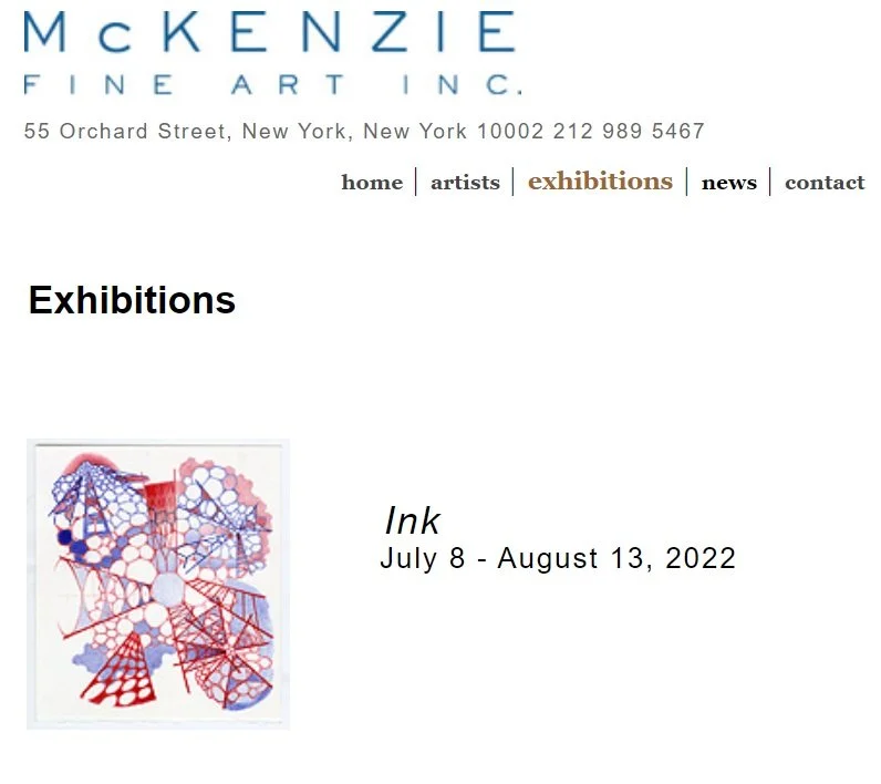
The opening reception for Ink is Friday, July 8 6:00-8:00 pm. It is free and open to the public. Please consider joining us!

The exhibition features thirty-nine works on paper in ink, by the following artists: Roberta Allen, Chris Arabadjis, Nancy Blum, Lori Ellison, Sky Pape, Jessica Deane Rosner, and Eric Wolf.

Roberta Allen’s works are made with metallic ink pens on black paper. Small-scale and intimate, these elegant and abstract diagrammatic drawings illustrate phrases written in cursive, part of Allen’s ongoing series exploring consciousness, Mind Matters: An Unscientific Exploration of the Mind. Combining the subjective and objective with text and imagery, the artist uses humor and paradox to “subvert the viewer’s expectations to stimulate self-awareness or reflection.” Chris Arabadjis creates his 11 x 10-inch drawings using red and blue ballpoint pens, largely during his two-hour daily subway commute. He employs a rule-based system, making marks while following rules that determine how it can be differentiated from the previous mark, mimicking a process of growth and mutation. Arabadjis describes the creation of his work as part of a meditative practice; he thinks of his drawings as “mini physics calculations or simulations…like trying to build my own universe from scratch.” In her drawings Nancy Blum creates undulant and biomorphic abstract forms by repeating adjacent lines with black and gold ink on white paper, or in one larger work, white ink on black paper. In the smaller drawings, the gold and white linear elements overlap so that moiré patterns emerge, adding an optical vibrancy to the work. Blum’s forms coil and pulsate with an organic, fecund energy, and are an expression of the artist’s desire to communicate the interconnectivity of all living things. Lori Ellison (1958-2015) was well known for her intricate, patterned drawings made with Paper Mate ballpoint pens on lined notebook paper. Ellison celebrated the use of humble, accessible, and portable materials, and as she noted, “….One does not have to make large work to hold a wall. Compactness and concision can be a relief in this age of spectacle.” Her drawings nearly always fill the page with a variety of repeated motifs. For example, in this show, circles, eye-shapes, star formations, basket-weaves, and biomorphic forms are all rendered with a devotional intensity. Sky Pape switched from working in oil to working with ink and paper after a series of life events made the former medium untenable. She has found ink to be an endlessly rich material for discovery and expression in her linear and patterned geometric abstract drawings. Working with white ink on black or blue grounds, Pape explores variations of radiant and complex configurations that shimmer and pulsate. For the artist, the slight irregularities in the drawings “reveal tipping points between stability and collapse, and the dance between continuity and uncertainty that pervades our lives.” Jessica Deane Rosner’s small-scale, dense, and detailed drawings are made predominately with ink but also include watercolor. They are part of her ongoing Ruled Unruled series, where sections of the work are made as perfectly as possible with drawing tools, with subsequent marks added freehand. The inclusion of brightly colored passages in two of the works is, for Rosner, a “representation of wary optimism in a violent, exhausting world of bad news and shocking events.” Eric Wolf is the sole artist in the exhibition who uses brushes rather than pens to apply ink to his paintings on paper. Bold and undulating passages in rich, dark blacks as well as tonal washes in gray describe the essence of rocks, bodies of water, distant mountains and changing light. Since the late 1980s the artist has traveled to the Phillips Memorial Wilderness Preserve near Oquossoc, Maine to directly observe the natural beauty of the locale. The resultant paintings are a vibrant and pure distillation of observed nature, each created in a single working session.

EXHIBITION

https://www.markelfinearts.com/exhibitions/115/overview/

Webstite 1.jpg

NEW YORK CITY - CHELSEA 529 West 20th, Suite 6W New York, NY 10011 Phone: 212.366.5368

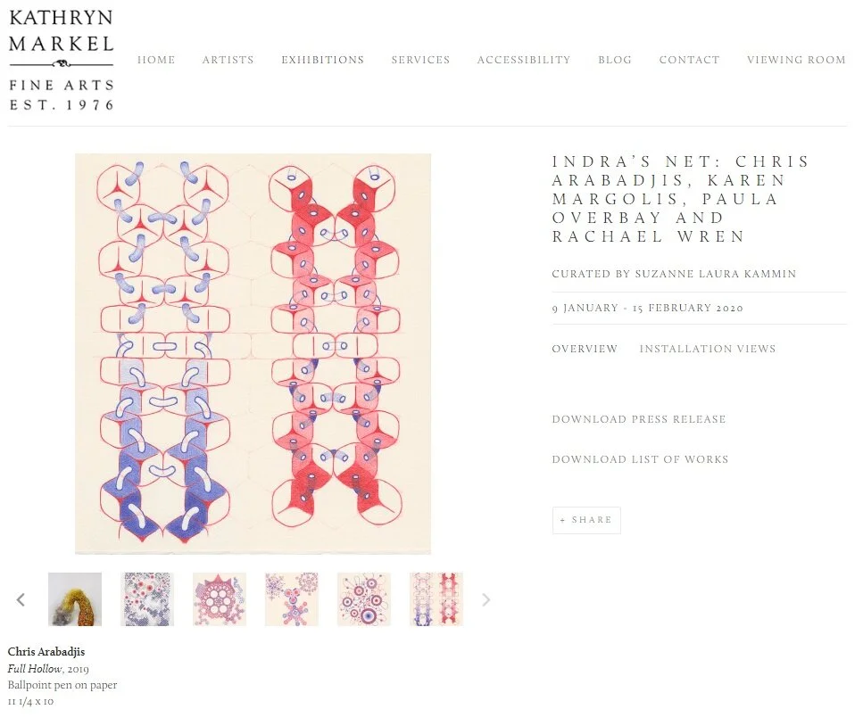
NEW YORK, NY –– January 9th, 2020 –– Kathryn Markel Fine Arts is pleased to present Indra’s Net, an exhibition of new work by Chris Arabadjis, Karen Margolis, Paula Overbay and Rachael Wren.

"They [Buddhas] know all phenomena come from interdependent origination. They know all world systems exhaustively. They know all the different phenomena in all worlds, interrelated in Indra's net." -The Buddha

Indra's Net is a metaphor used to illustrate the Buddhist concept of Sunyata or emptiness -the idea that nothing possesses inherent existence and that everything depends on parts, on causes and conditions and on the mind. Because nothing possesses inherent existence, everything is interdependent and there is no beginning and end to anything.

This Buddhist concept of Sunyata is echoed in Ein Sof from the Kabbalistic tradition and in Christian mysticism through the Via Negativa. In addition, these concepts also relate to theories put forward by quantum physics. Though not identical, similarities can be found in quantum mechanics' entanglement theory, the observer effect and the quantum field.

This exhibition will bring together four artists whose work, through repetition of mark and/or shape, alludes to concepts of infinity both on the macro and micro level.

Interview

​Interview by Kiran Gurung, Colloquium Manager​Kiran Gurung: What is the source of inspiration for your ballpoint pen drawings? Christopher Arabadjis: I’m inspired by so many different things... patterns in science, mathematics, technology, nature, …

Interview by Kiran Gurung, Colloquium Manager

​Kiran Gurung: What is the source of inspiration for your ballpoint pen drawings?
Christopher Arabadjis: I’m inspired by so many different things... patterns in science, mathematics, technology, nature, architecture, clothing, drawings by artists and by children, etc.

KG: Could you explain the difference between your small and large pieces... how do you choose your scale?
CA: The smaller drawings are my laboratory. Anything goes as long as it fits my process of starting with single mark and a rule for how to repeat it. I make them on the train. So they must fit inside my backpack. I use the flat cardboard boxes used to ship 12" LPs to hold them. So I cut larger paper to fit inside. The larger drawings come about because I see something I like in a smaller drawing that I want to explore on a larger scale. For example, I’ll Take You There grew out of Untitled (2019-01-002) which was inspired by thinking about board games played in a 3-D space. Of course, the larger the paper the less significant a ballpoint pen mark becomes when looking at the work as a whole.

KG: What have you learned about ballpoint pen as a medium?
CA: Ballpoint pen has a “dry ink” that does not flow quickly. It can therefore be used to create gradations from low to relatively highly saturated color. As the Impressionists discovered, the most vibrant color combination comes not from layering one color on top of another, but from laying down a patchwork of small adjacent areas of color. Consistency of color is the most difficult aspect. It requires a relaxed grip and rhythmic motion. I’ve learned that I have a much lighter touch in the morning than I do late in the day. The energy within a field of color depends on the direction and uniformity of marks within it. Ballpoint pen is unforgiving in the sense that it does not erase. So the easiest way to hide an errant mark is to surround it with similar marks - like hiding in a crowd. In general one approaches ballpoint pen the same way one does watercolor working light to dark, though I break this rule all the time. The latest discovery I’ve made happens at the boundary when laying down two adjacent colors. If done in such a way that no inconsistent lighter areas occur with no overlapping of unlike colors, the boundary almost disappears. It is more pronounced when the colors are of equal saturation, but can happen even when this is not the case. It’s magical!

KG: What are you working on right now?
CA:
I’m still making small ballpoint pen drawings every day on the train, and larger ones in my studio. However, I’ve also started to explore the use of oil pastels. I don’t have a body of work yet, but my last show had one large experimental drawing in it. Because the marks are considerably bigger than that of a ballpoint pen, coverage comes much faster. With ballpoint pen my hand is always moving. All marks are small ones so coverage takes time. With oil pastels I’ve had to take a deep breath between marks. Lots of stepping up to make a mark, and then stepping back to look. I’m still getting used to the change in process.

Press

2019-06 The Ballpointer Picks Page.jpg

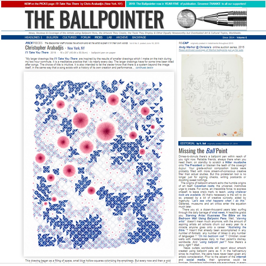
Christopher Arabadjis・New York, NY

I'll Take You There   2019 ・ 16 x 20'' (40.64 x 50.8cm) ・ ballpoint pen on paper 


​​''My larger drawings like I’ll Take You There  are inspired by the results of smaller drawings which I make on the train during my two hour commute. It is a meditative practice that I do nearly every day. The larger drawings have for some time been titled after songs. The choice of title is intuitive. It is also intended to let the viewer know that there is a system beyond the image itself, in the same way that a song exists with a history of its own creation and performance.

  This drawing began as a filling of space, small blue hollow squares colonizing the emptiness. But every now and then a void could not be filled and a bloom of red sprang up. That space was not to be intruded upon. So the squares went around. Red blooms of differing sizes continued to appear and prevent the occupation by blue squares, and the squares continued to fill in around them. As the blue squares multiplied, some began to develop a structure as a way to defend against an error in their creation: an unintended thickening of the delicate line that defined them. 
     In time the whole plane was filled except for the red blooms and a band of emptiness near the border—a kind of no-squares zone. The development of structure continued into neighboring squares where no errors had occurred. At the same time the red blooms seemed to reach out and blush the centers of many of the still empty squares. And many of those squared in turn developed a lighter blue structure similar to the deeper blue of the original squares. And that is where this drawing stopped. 
     I start these drawings the same way, with a mark and a rule for how to repeat it. A rule usually describes how different the next mark can be from the previous one. I try to rigorously adhere to the rules. Once this process is set in motion, I let go and see where it takes me. Each mark is a small yet conscious decision, but I work quickly enough that it does not feel that way. In fact I often feel like I don’t know what I’m doing. If a drawing seems to stall under the weight of too much homogeneity I will loosen the rule or introduce another system to allow for greater diversity. 
     I think of my smaller drawings as mini physics calculations or simulations. Like trying to build my own universe from scratch, or as we say in physics from first principles. The development of each drawing mimics the process of growth with a built-in mechanism for mutation—the inability of my hand or my mind to remain free of error. I don’t use any tools beyond the pen itself. And I’ve come to see errors as acts of creativity. 
     I experience two distinct sensations when I draw. One is the feeling that I’m busy at work making mark after mark. I enjoy having a strong sense of purpose. When I’m making the small drawings on the train, I have a fantasy that my drawing helps the train run. The other sensation is that of an observer. Surrendering to the process, I watch as if I have no idea what’s coming next. Every new move is a surprise. I even feel a sense of admiration for how the person drawing seems to create this universe out of his imagination''  

For more art, information & contact :www.chrisarabadjis.com All artwork © Christopher Arabadjis

Exhibition

accidental_degeneracies_posters 300dpi 1500px.jpg

Pratt Institute’s Art & Design Education Department Presents:

Accidental Degeneracies

Chris Arabadjis

February 4 - March 2019

Opening Reception: Feb 4, 4pm-?

Exhibition

Indra's Net invitation.jpg

The Gallery at Caldwell University Presents:

INDRA'S NET

Chris Arabadjis

Robert Lach

Paula Overbay

Rachael Wren

Feb. 6 - Mar. 6, 2019

Artist's Talk: Wed. Feb. 6, 5-6pm

Opening Reception: Feb 6, 6-8pm